PLUCIA BY AGROPHONICS / SELECTED DIRECTION

PLUCIA BY AGROPHONICS / SELECTED DIRECTION

Plucia: FMCG Branding and Packaging Design

Plucia: FMCG Branding and Packaging Design

From warehouse to wishlist.

From warehouse to wishlist.

From warehouse to wishlist.

BB Studio developed Plucia for Agrophonics, connecting brand positioning, visual identity and packaging design to give frozen fruit a distinctive consumer-facing presence.

BB Studio developed Plucia for Agrophonics, connecting brand positioning, visual identity and packaging design to give frozen fruit a distinctive consumer-facing presence.

Complete Plucia frozen-fruit identity artwork with cream wordmark against an icy blue graphic background

CLIENT

Agrophonics

BRAND

Plucia

SECTOR

Frozen fruit and FMCG

FOCUS

Brand positioning, visual identity and packaging design

01 / THE CHALLENGE

Give a familiar category a different kind of presence.

Give a familiar category a different kind of presence.

Give a familiar category a different kind of presence.

Agrophonics wanted to evolve from a product-focused frozen-fruit supplier toward a more expressive consumer brand. The brief called for a visual direction that could connect product clarity with a distinctive personality.

Agrophonics wanted to evolve from a product-focused frozen-fruit supplier toward a more expressive consumer brand. The brief called for a visual direction that could connect product clarity with a distinctive personality.

Agrophonics wanted to evolve from a product-focused frozen-fruit supplier toward a more expressive consumer brand. The brief called for a visual direction that could connect product clarity with a distinctive personality.

02 / THE RESEARCH

Before the identity, we studied the category.

Before the identity, we studied the category.

Before the identity, we studied the category.

We reviewed frozen-fruit packaging and broader consumer-brand references to understand how brands communicate product quality, personality and recognition. The exploration considered how Agrophonics could connect its product expertise with a more expressive consumer identity.

We reviewed frozen-fruit packaging and broader consumer-brand references to understand how brands communicate product quality, personality and recognition. The exploration considered how Agrophonics could connect its product expertise with a more expressive consumer identity.

Third-party frozen-fruit packaging reviewed as category research references

FROZEN-FRUIT CATEGORY REVIEW / THIRD-PARTY BRAND REFERENCES

Third-party colour, typography and consumer-brand references used for comparative research

BROADER VISUAL REFERENCES / COLOUR, TYPOGRAPHY AND CONSUMER-BRAND EXPRESSION

Reference brands shown for comparative research; their identities and packaging were not designed by BB Studio.

Product clarity

Keep the product recognisable and easy to understand.

Brand personality

Give familiar fruit a more distinctive visual presence.

Connected touchpoints

Carry the same identity from packaging into digital communication.

03 / CREATIVE EXPLORATION

Three directions. One clear choice.

Three directions. One clear choice.

Three directions. One clear choice.

We explored three ways to build a frozen-fruit brand: Freshly Frozen kept product clarity front and center, Bearfruits introduced a friendly character, and Plucia turned up the expression. Seen together, they show the thinking that led us to the final direction.

We explored three ways to build a frozen-fruit brand: Freshly Frozen kept product clarity front and center, Bearfruits introduced a friendly character, and Plucia turned up the expression. Seen together, they show the thinking that led us to the final direction.

One-slide comparison of Freshly Frozen, Bearfruits, and Plucia frozen-fruit packaging directions

FRESHLY FROZEN / BEARFRUITS / PLUCIA

04 / THE SELECTED DIRECTION

From routes to a brand.

From routes to a brand.

From routes to a brand.

Plucia stood out for its graphic wordmark, expressive fruit imagery and flexibility across packaging and digital. We carried that direction into a connected visual identity.

Plucia stood out for its graphic wordmark, expressive fruit imagery and flexibility across packaging and digital. We carried that direction into a connected visual identity.

Plucia stood out for its graphic wordmark, expressive fruit imagery and flexibility across packaging and digital. We carried that direction into a connected visual identity.

Selected Plucia brand campaign visual with graphic wordmark, floating berries and expressive portraiture

A brand world in motion.

A brand world in motion.

A brand world in motion.

Plucia brand communication explorations arranged as a campaign image grid

BRAND COMMUNICATION EXPLORATIONS

05 / VISUAL IDENTITY

Big letters. A clear personality.

Big letters. A clear personality.

Big letters. A clear personality.

The graphic wordmark anchors Plucia’s identity. Icy blue and warm cream give the letterforms room to lead, while fruit photography adds colour and movement.

The graphic wordmark anchors Plucia’s identity. Icy blue and warm cream give the letterforms room to lead, while fruit photography adds colour and movement.

BOLD BY DESIGN. FULL OF FLAVOUR.

Plucia wordmark and identity explanation presented over a patterned icy blue brand background

AN EXPRESSIVE MARK / AN ENTIRE WORLD AROUND IT

06 / PACKAGING DESIGN

Personality on pack. Clarity at a glance.

Personality on pack. Clarity at a glance.

Personality on pack. Clarity at a glance.

The selected Plucia packaging explores a clear hierarchy for the brand name, fruit variety and product information. The design variations develop that visual language across the pack.

The selected Plucia packaging explores a clear hierarchy for the brand name, fruit variety and product information. The design variations develop that visual language across the pack.

Complete Plucia frozen-blueberry packaging concept showing carton dieline, repeating logo pattern and back-of-pack composition

PACKAGING DESIGN EXPLORATION / FROZEN BLUEBERRIES

A family of variations.
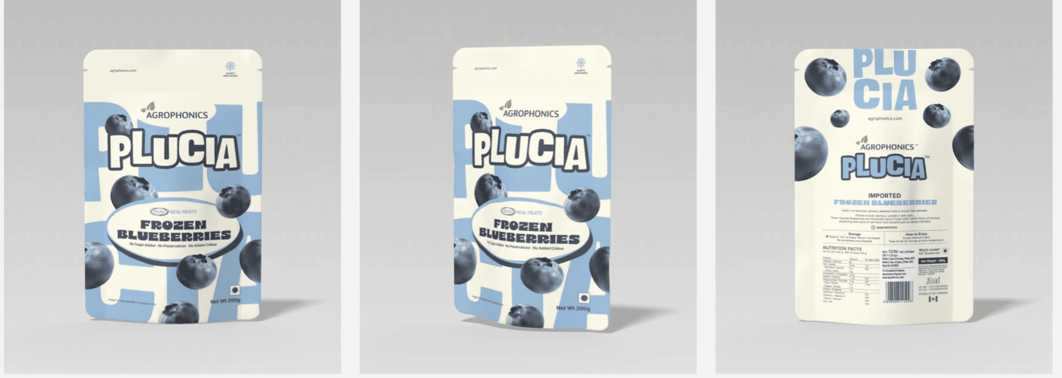
Plucia frozen-blueberry packaging design variations presented as an uncropped deck composition

PACKAGING DESIGN VARIATIONS / BLUEBERRY

07 / DIGITAL APPLICATION

From the pack to the screen.

From the pack to the screen.

From the pack to the screen.

The same wordmark, colour and fruit imagery extend into a digital concept, connecting the packaging to an online experience.

The same wordmark, colour and fruit imagery extend into a digital concept, connecting the packaging to an online experience.

Plucia website concept shown within an Agrophonics storefront mockup with floating blueberries and large brand graphics

DIGITAL APPLICATION / WEBSITE CONCEPT

THE SHORT VERSION

A few good questions.

A few good questions.

A few good questions.

Who created the Plucia brand identity?

Who created the Plucia brand identity?

BB Studio developed the Plucia identity for Agrophonics, including brand positioning, visual identity and packaging design explorations.

BB Studio developed the Plucia identity for Agrophonics, including brand positioning, visual identity and packaging design explorations.

What creative routes did BB Studio explore?

What creative routes did BB Studio explore?

We presented Freshly Frozen, Bearfruits and Plucia side by side, then developed Plucia into the final identity.

We presented Freshly Frozen, Bearfruits and Plucia side by side, then developed Plucia into the final identity.

What does this FMCG branding case study show?

What does this FMCG branding case study show?

It shows how category research and alternative creative routes informed a connected brand identity, packaging system and digital applications.

It shows how category research and alternative creative routes informed a connected brand identity, packaging system and digital applications.

BB STUDIO / MADE, NOT CHURNED

Made, Not Churned.

Made, Not Churned.

Made, Not Churned.

Building an FMCG brand? Let’s bring positioning, identity and packaging into one clear direction.

Building an FMCG brand? Let’s bring positioning, identity and packaging into one clear direction.

Discuss Your FMCG Brand

Let’s make something worth signing.

Let’s make something worth signing.

1908, 19th Floor, Kamdhenu 23 West, Thane Belapur Road, Koparkhairne, Navi Mumbai 400709

Instagram / LinkedIn